Tazo Tea Repackaging Series
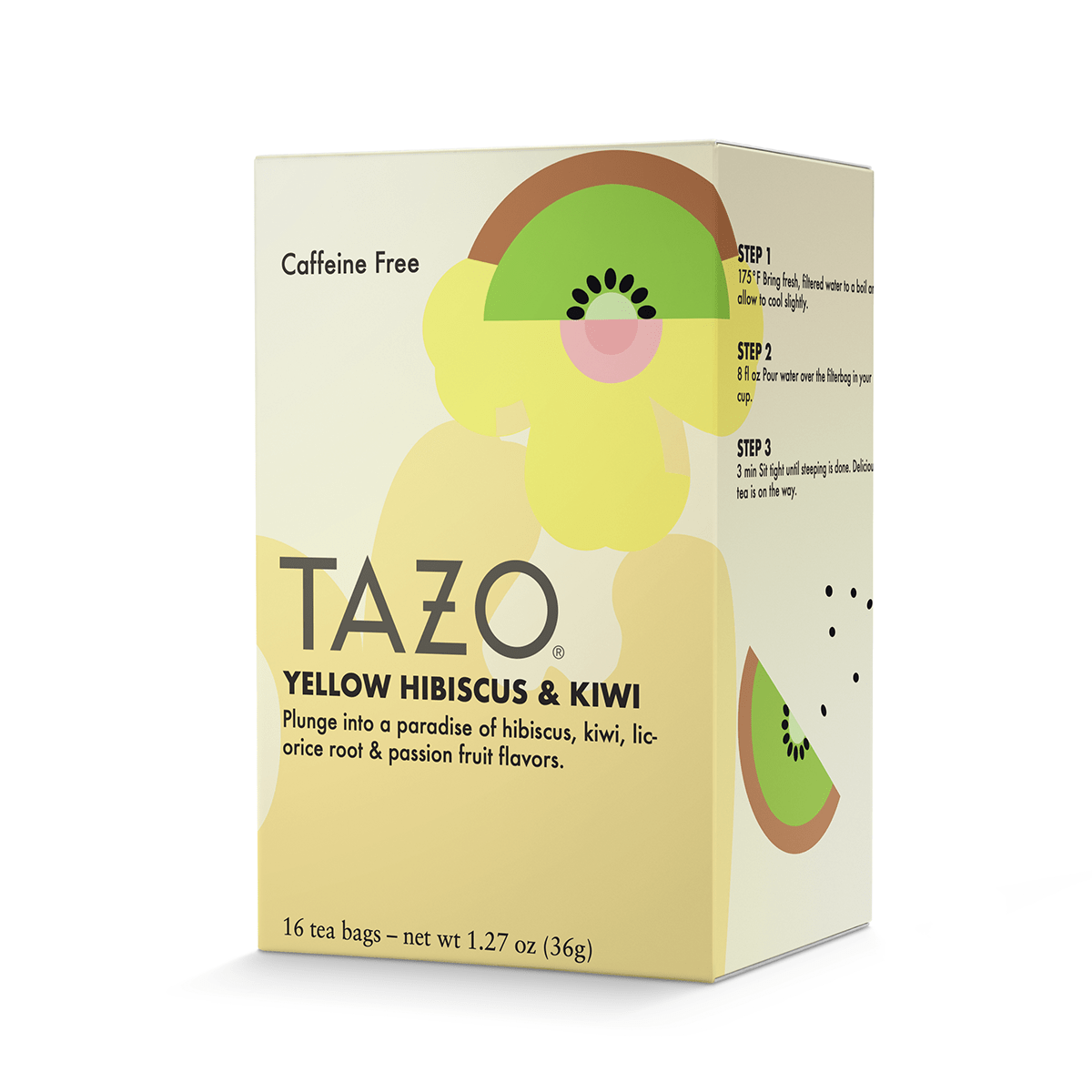
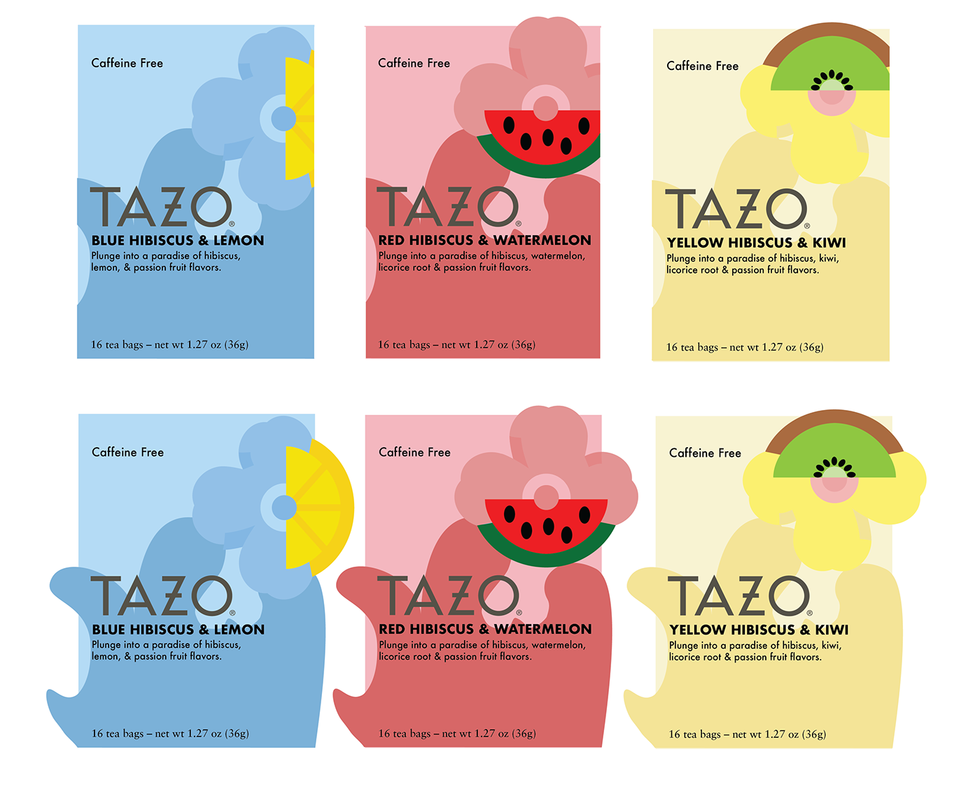
This project is a study of packaging and packaging series design. This project is a repackaging and series design of the brand Tazo Tea. The three new flavors were
inspired by hibiscus tea with the flavors of blue hibiscus & lemon, red hibiscus & watermelon, yellow hibiscus & kiwi. With the original logo of Tazo Tea, the fonts used are Futura and Charter. The series includes primary colors as the main colors of the flowers and background. The illustrations used are a combination of the flower and fruit split in half. Behind the logo and flavor of the tea is a splash art of the color of the tea when brewed. This was inspired by the original packaging as it also had a splash design on the bottom of the boxes. This design doesn’t have a bottom panel to save ink and isn’t seen as much as the other panels.


Mockup: